Update controls: rectangular button and improvement of the slider

February 12, 2015
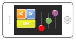
The button can now be rectangular. Improved slider allows you to set it one of the three central position: on top, bottom and middle. For slider you can set the auto-centering when touch up the finger.
To use the new functionality, you must upgrade the version of Android applications to 3.1.1.
You can select display option buttons: round or rectangular, this can be done in the context menu of the button's setting. Rectangular button can have an elongated shape as horizontally and vertically. In particular, it can be square.
Slider got new features. You can set the central position of the slider, which will correspond to the zero value. It may be lower, upper or middle position for the vertical slider. For the horizontal slider is possible to set the left, right or middle position. When starting graphical interface, the slider will be set in initial position at the zero point. When using the middle position of the center, the slider's values range are from -100 to 100. To the edge positions, the range remained the same, from 0 to 100.
The slider now you can set the auto-centering. If you set auto-centering the slider will set the zero position when you remove your finger. If the auto-centering is not activated, the slider will behave as before, to remain in the prescribed position.
In aggregate, now the slider can be used with much greater capabilities and more projects. Setting the slider is in the context menu touched by a right mouse button on the element.


 Русский